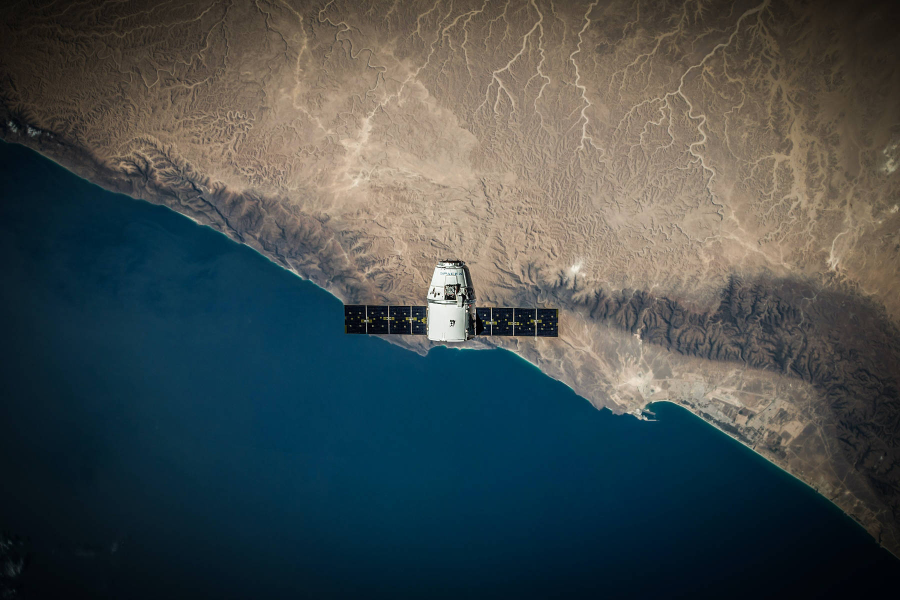
For reporters, satellite data offers unique opportunities for original investigations and visual storytelling. But how do you get started? And what should you be looking out for?
I spoke to four journalists who regularly work with satellite data about how to start, best practices and — most importantly — mistakes to avoid. Here’s what I learned:
Managing expectations
The first thing you’ll need to do is manage your (and your editor’s) expectations. Johanna Wild, an investigative tech specialist at Bellingcat, says that people often come at it with unrealistic ideas about what is possible.
“The idea that you could track a person, or even some small vehicle relevant to your investigation — it just doesn’t work like that.”
Spend some time looking at satellite imagery and familiarise yourself with the data and the type of tools that are available. This will give you an idea of how you might be able to use it in a story.
“You need to know very clearly in which cases it makes sense to use satellite imagery, and in which cases it does not,” says Wild.
Getting started
Google Earth, Sentinel Hub and NASA’s Worldview are great places to get started. They all allow access to high-resolution satellite imagery for free.
But Marco Hernandez, a data visualisation developer at Reuters Graphics, recommends looking beyond the images.
“It’s not just pictures — satellites offer data to play with. You can work with that data to show something different, something more sophisticated.”
“Sometimes you see reporting that uses satellite imagery basically as decoration — it forms the replacement for using a stock image. This is not a mistake as such, but they’re missing out on the potential, " says Johanna Wild.
How you should use satellite data depends on your reporting, but a good rule of thumb is to approach it like any other data source. You might start with a tip-off about something that’s happened, and use satellite imagery to verify the information. Or you might already have a story, and look for data that helps you put that issue in context.
Don’t rely on one source
Just like you would never rely on only one person’s anecdote when reporting a story, you shouldn’t rely on one satellite image either. It’s easy to misinterpret what you see, and there’s always a chance that the image has been tampered with.
“If something looks like what you think it is, it doesn’t mean that’s what it is, " says Ben Heubl, an investigative data journalist.
“You might think you’re 95% sure of what you’re seeing, but you need to think about that 5% uncertainty.”
Wim Zwijnenburg, a Bellingcat contributor and project leader at PAX, recalls an incident where someone reported an oil spill based on black spots that were visible around an oil tanker off the coast of Jemen.
On closer inspection, the black spots in the image turned out to be from naturally occurring phytoplankton.
With satellite data you need to be especially careful, says Heubl, as satellite imagery often provides a window into politically sensitive areas.
“You could spark a diplomatic scandal, and you could well be wrong, so you need to be careful. You need to verify with other sources, like flight data, weather data, local news reports, social media, sources on the ground, etcetera.”
He recommends always keeping the ‘Thomas theorem’ in mind: “If you define situations as real, they are real in their consequences.”
Two common mistakes to avoid
Johanna Wild says that people sometimes misread the copyright date on Google Maps as the time when the imagery was taken. “This could potentially lead to wrong claims regarding the time of an incident (for instance, the destruction of a building etc.).”
Pierre Markuse, a remote sensing expert, explains in a blog post that you should be careful when characterising images of wildfires. It may look like you can see flames in the image, but often this is just a visualisation of fire hotspots based on infrared radiation.
You’ll need to convey to your audience what it is they’re seeing.
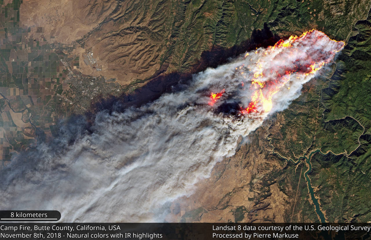
No, those aren’t flames.
Don’t lose sight of the story
With an endless stream of new satellite imagery being published in near real-time, it’s easy to get lost in the amount of data that’s available.
“It is a very deep sea, and if you’re not careful and set your priorities, you can get lost easily,” says Marco Hernandez.
Marco speaks from first-hand experience. One example he gives is about a dust storm over Beijing. After collecting some initial data and calculations he figured he had a good story. But then he discovered that Chinese satellites had captured even better images of the scene, complete with time-lapse videos.
While the imagery was stunning, it took him several days to go through and analyse it. Everything was in Chinese — a language he does not speak. By the time he was done, the storm had passed and the story had lost its relevance.
Sometimes it can pay off to go that extra mile though. For a piece called ‘Disaster in the Himalayas’, Hernandez and his colleagues created a 3D render of the location of a landslide that wreaked havoc in the mountains of India.
Based on high-resolution images from a company called Planet, the visualisation manages to capture and convey the details of the disaster in a way that a simple image from above simply wouldn’t have.
“It’s not just about showing the data from the satellites, but about finding the best angle to tell your story,” says Hernandez.